Day 26 - Draw Down the Moon - A Poster
Illustrating Draw Down the Moon – A Deep Dive into the Process
For the past month, I’ve been working on a daily illustration challenge—bringing each track from Draw Down the Moon by Foxing to life through my own visual interpretations. This was one of the most ambitious projects I’ve taken on, and now that it’s complete, I can finally reflect on the process, the inspiration, and the creative techniques I used to tie everything together.
Design Approach: A Mid-Century Modern Aesthetic with a Textured Twist
From the start, I knew I wanted a cohesive visual language for the series—something bold yet timeless, structured yet fluid enough to adapt to each song’s emotion. I leaned heavily into a mid-century modern graphic design aesthetic, drawing inspiration from vintage print posters, bold minimalism, and a strong use of negative space.
To capture that aged, tactile quality, I incorporated paper textures, old print imperfections, and halftone effects. I primarily used Retro Supply Co. brushes and textures, which helped add that slightly worn, screen-printed feel—giving the designs an organic, imperfect character. Instead of flat, sterile digital illustrations, I wanted these to feel like they could have been pulled from an old record sleeve or a forgotten zine.
Color was another key element. While each piece had its own palette, I maintained a sense of harmony across the series, leaning into muted, desaturated tones that felt both nostalgic and slightly eerie—a visual echo of the album’s themes of longing, the supernatural, and the unknown.
Breaking Down Each Song’s Visual Concept
Here’s a deeper dive into how I interpreted each track visually:

737
This song carries such a heavy weight of exhaustion, loneliness, and the feeling of being stuck in a cycle. I translated that into an image of a 737 modeled after a beached orca whale—a powerful creature stranded, its wings sagging under its own weight. Much like the song, it represents something that was meant to be free, now left helpless. The minimal composition reinforces the sense of isolation.
Go Down Together
A song about reckless commitment—choosing to take a leap into the unknown, regardless of the consequences. I illustrated two figures standing on the edge of darkness, one pointing the way forward. There’s no clear path, only the certainty that they’ll jump together.

Beacons
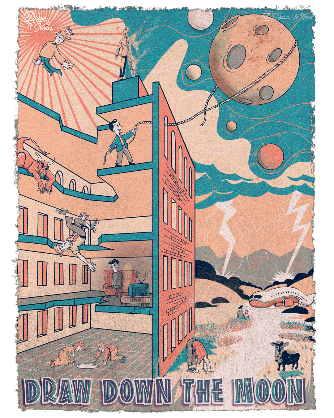
A song about searching for meaning and recognition. The lyric "king of nothing but the space I take up" stood out to me, so I depicted a lone figure floating in space, wearing a crown, with the sun looming behind him. He has power, but over what? The emptiness around him.
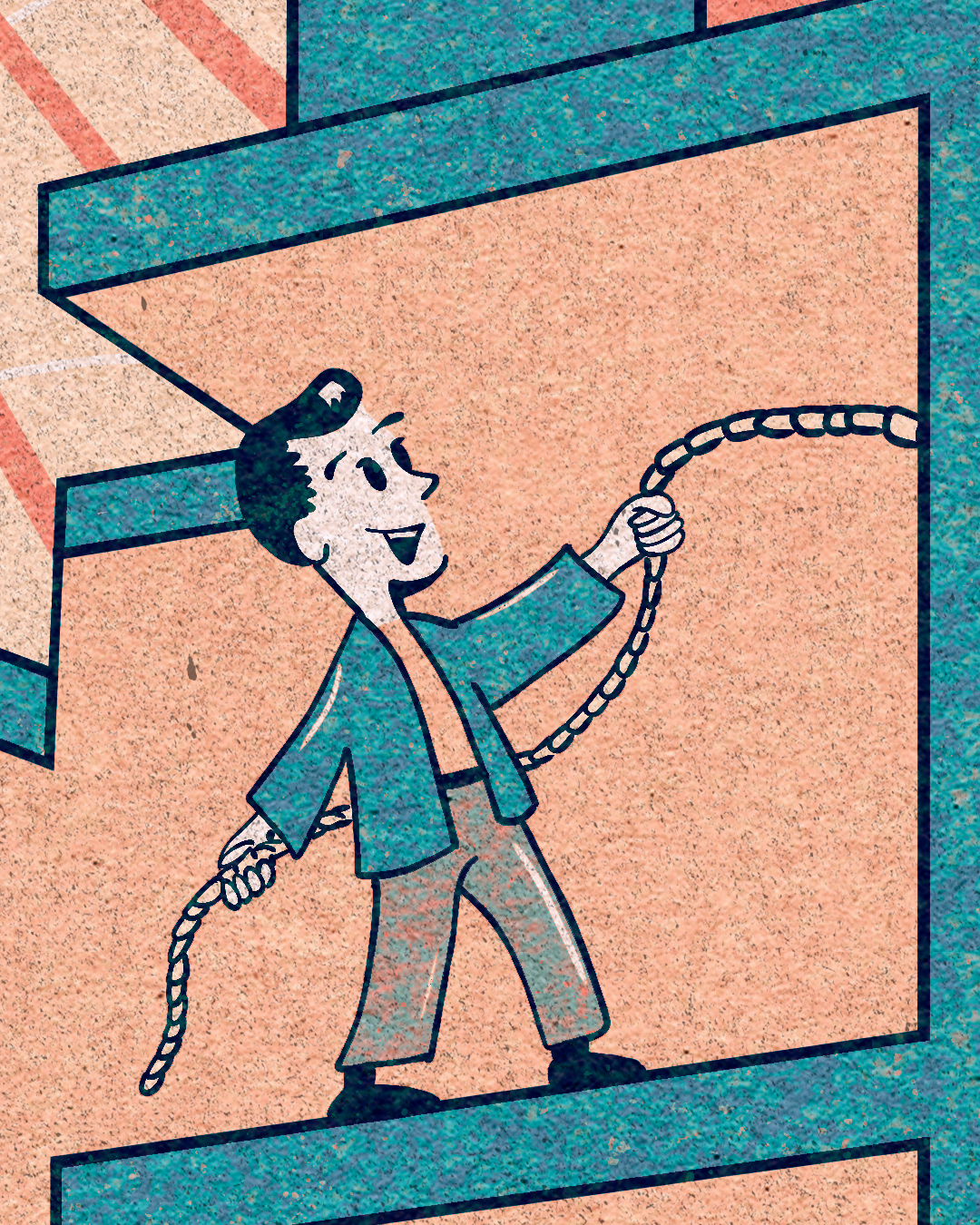
Draw Down the Moon
This track feels like a desperate attempt to hold onto something impossible. I visualized a figure pulling the moon toward them, tied to a rope through a window—as if trying to bring the unreachable within grasp. The flat, graphic shapes give it a celestial, almost tarot-like quality.

Where the Lightning Strikes Twice
The song’s name instantly evoked imagery of fate and repetition. I placed two distinct lightning bolts in the background, with the figures from a previous illustration hiding in the bushes, as if waiting for something inevitable to strike again.
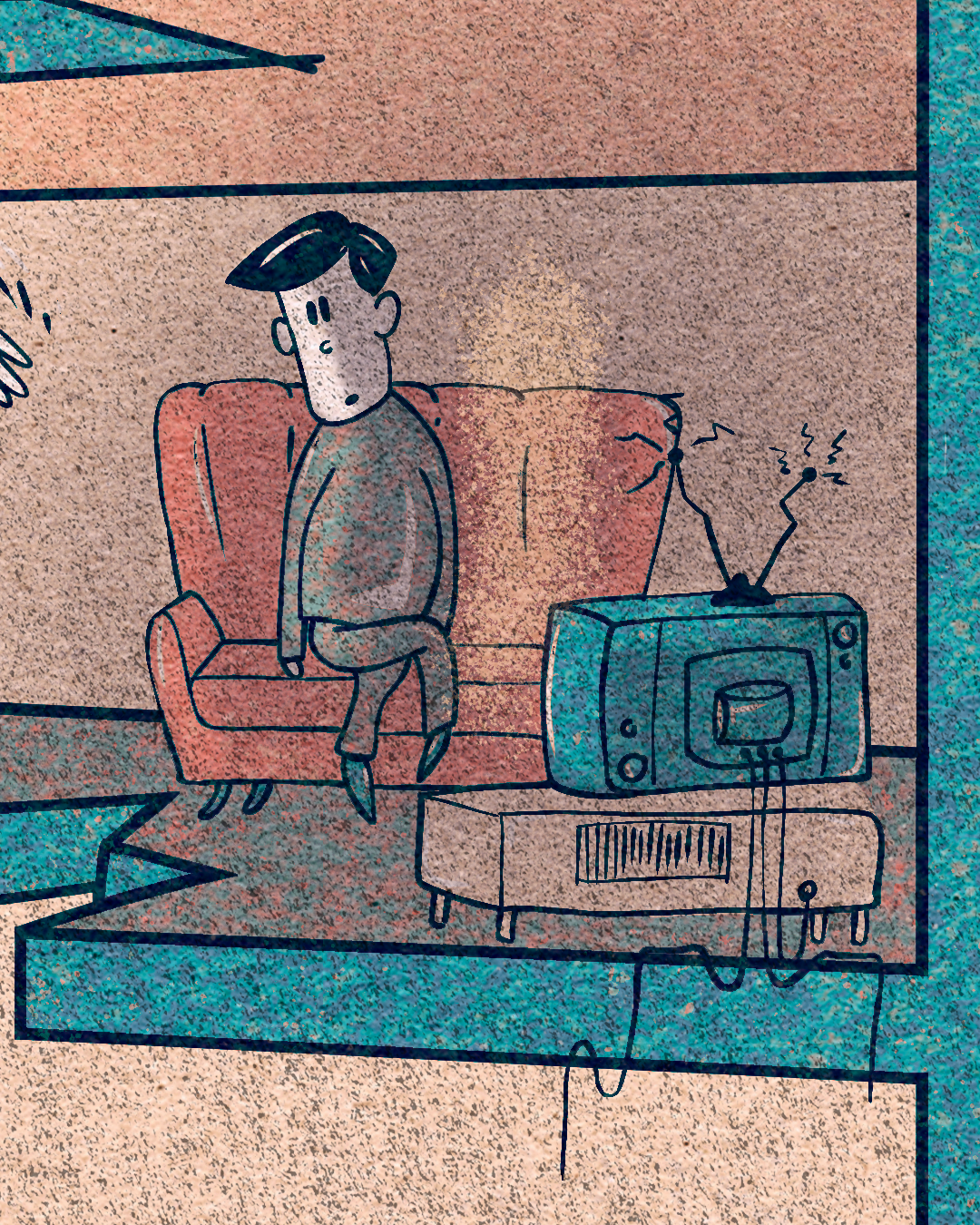
Bialystok
The feeling of loss and longing is so strong in this track. I depicted a man alone on a couch, with the scratched-out ghost of his missing love next to him. The absence is louder than the presence—just like in the lyrics:
"I was just thinking about watching television next to you… just to sit there and not do much of anything at all."
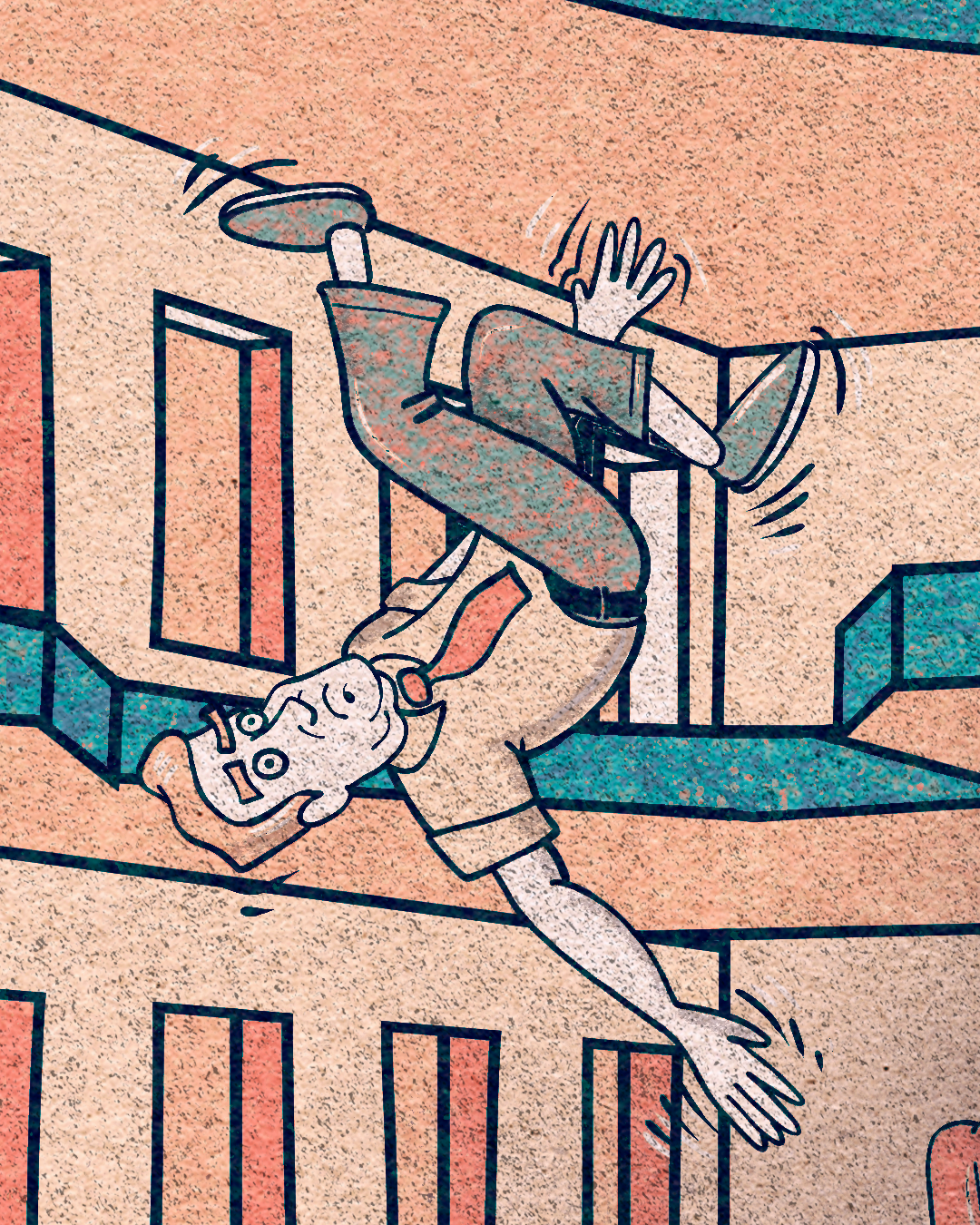
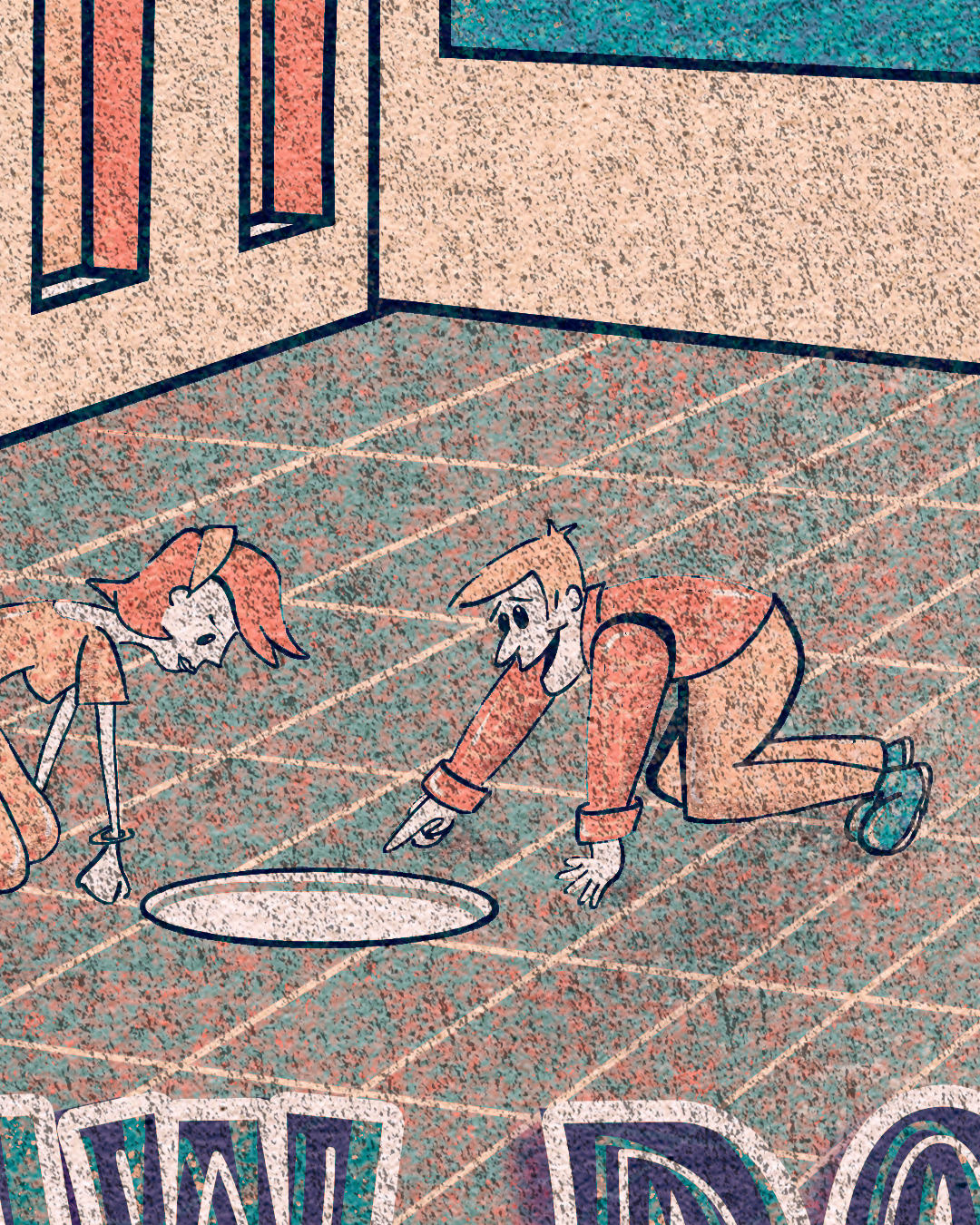
At Least We Found the Floor
A chaotic, spiraling song that feels like plummeting with no control. I portrayed a man crashing through the floors of a building while a devil perches at the top, watching—as if amused by his downfall. The fragmented structure of the illustration mirrors the descent.

Cold Blooded
One of the most straightforward yet effective designs in the series. The lyric “I know I’m a black sheep, walking the field like a Golden Fleece” stood out, so I made the entire piece revolve around that idea. A single black sheep stands apart, symbolic of isolation and self-awareness.

If I Believed in Love
This song feels both deeply cynical and darkly humorous, which led me to a slightly absurd visual approach. I latched onto the lyric “I’d put my head in the sand until I’m left alone” and illustrated a figure literally sinking their head into the ground, their neck stretching and disappearing into the earth. It’s an exaggerated, surreal depiction of avoidance and escapism.
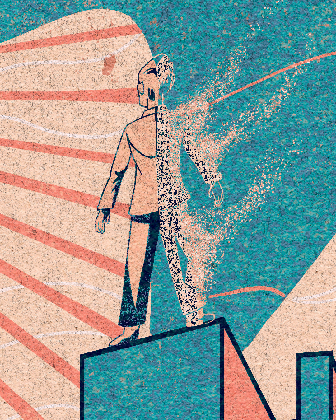
Speak with the Dead
The perfect closing track—reflective, haunting, and filled with a sense of finality. I focused on the line “Our essence dissipates all the same” and created an ethereal moment of transition between life and death, a soul fading away. It serves as a fitting sendoff, not just for the album, but for this entire illustration project.
Final Thoughts: A Challenging but Rewarding Process
Illustrating Draw Down the Moon was a deeply immersive experience. Each piece pushed me creatively, whether through composition, storytelling, or experimenting with textures. The challenge of maintaining a consistent mid-century modern aesthetic while still making each song feel unique was a balancing act, but seeing it all come together as a full collection makes it worth it.
Foxing’s music is layered, emotional, and visually evocative—translating that into artwork was no small task, but it was an incredibly rewarding one.
Would love to hear your thoughts—whether on the art, the album, or both! Let me know which piece resonates with you the most.